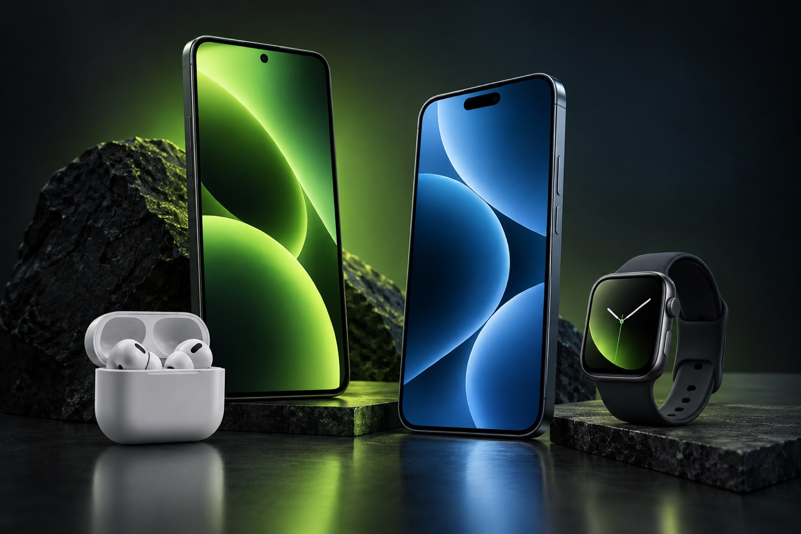
For years, the iPhone offered a clear bargain: users surrendered some visual control in exchange for consistency. Applications occupied a predictable grid, system elements behaved in familiar ways, and one iPhone could be understood by anyone who had used another. As iOS adds widgets, flexible layouts, themes, shortcuts, and deeper controls, that bargain is changing.
Customization is valuable because phones are personal objects. They carry memories, relationships, work, entertainment, and private routines. An interface that reflects those priorities can reduce friction as well as express identity. A useful home screen is not merely attractive. It places the right information and actions where attention naturally goes.
The risk is that flexibility becomes maintenance. If every visual change requires reorganizing multiple screens, repairing inconsistent icons, or managing an expanding system of modes, customization creates another task. The strongest iOS approach is therefore not to copy every option available elsewhere. It is to offer meaningful choices with sensible defaults and stable behavior. A user should be able to stop adjusting the phone and continue enjoying the result.
Apple’s design challenge is to preserve hierarchy. Widgets, notifications, live information, and application icons all compete for limited attention. More freedom can make the interface feel less calm if the system does not help users understand what is important. Thoughtful alignment, accessible contrast, predictable gestures, and reversible changes matter more than the sheer number of settings.
Successful customization will make two iPhones look and behave differently while allowing both to remain unmistakably understandable. That balance fits Apple’s historical strength: reducing complexity without pretending people are identical. Personalization should give the user ownership, not a new obligation to manage the operating system.
Conversation
0 commentsNo comments yet. Start a useful conversation.